On this page
Image with hotspots (interactive) – what this section can do
The Image with hotspots section turns a static image into an interactive element. You place hotspots on the image, the visitor clicks them, and a tooltip appears. The look of both the dots and the tooltips can be customised to match your brand.
Tip
Hotspot tooltips support bold text and links – you can point to another page or product.
Appearance options
- Custom dot color – match the clickable dots to your brand
- Custom tooltip color – set both the background and the text color of the tooltip
- Dot size – four sizes (S, M, L, XL) depending on emphasis
- Pulsating dots – a gentle animation highlights that they are clickable
- Tooltip font size and corner radius – fine-tune the tooltip style
What it is good for
- Describing individual parts of a product or packaging
- Interactive maps, floor plans, and diagrams
- Explaining parts of a screenshot or user interface
- Presenting details of a brand design
Variant: Default (default colors)
The default look of the section. The dots use the primary color from the color settings and the tooltip is black with white text. The dots also gently pulse to highlight that they are clickable.
Note
You place the hotspots directly on the image – just click and enter a caption.

-
Upper-left area – ideal for key messages or a logo.
-
The center of the image usually attracts attention first.
-
A detail in the corner—a good place for additional information.

Variant: Dot size and pulsating
The dots come in four sizes (S, M, L, XL). Here they are set to XL and pulsating is turned off, so the dots stay still. Larger dots work well on large images or when you want to emphasize the dots more.
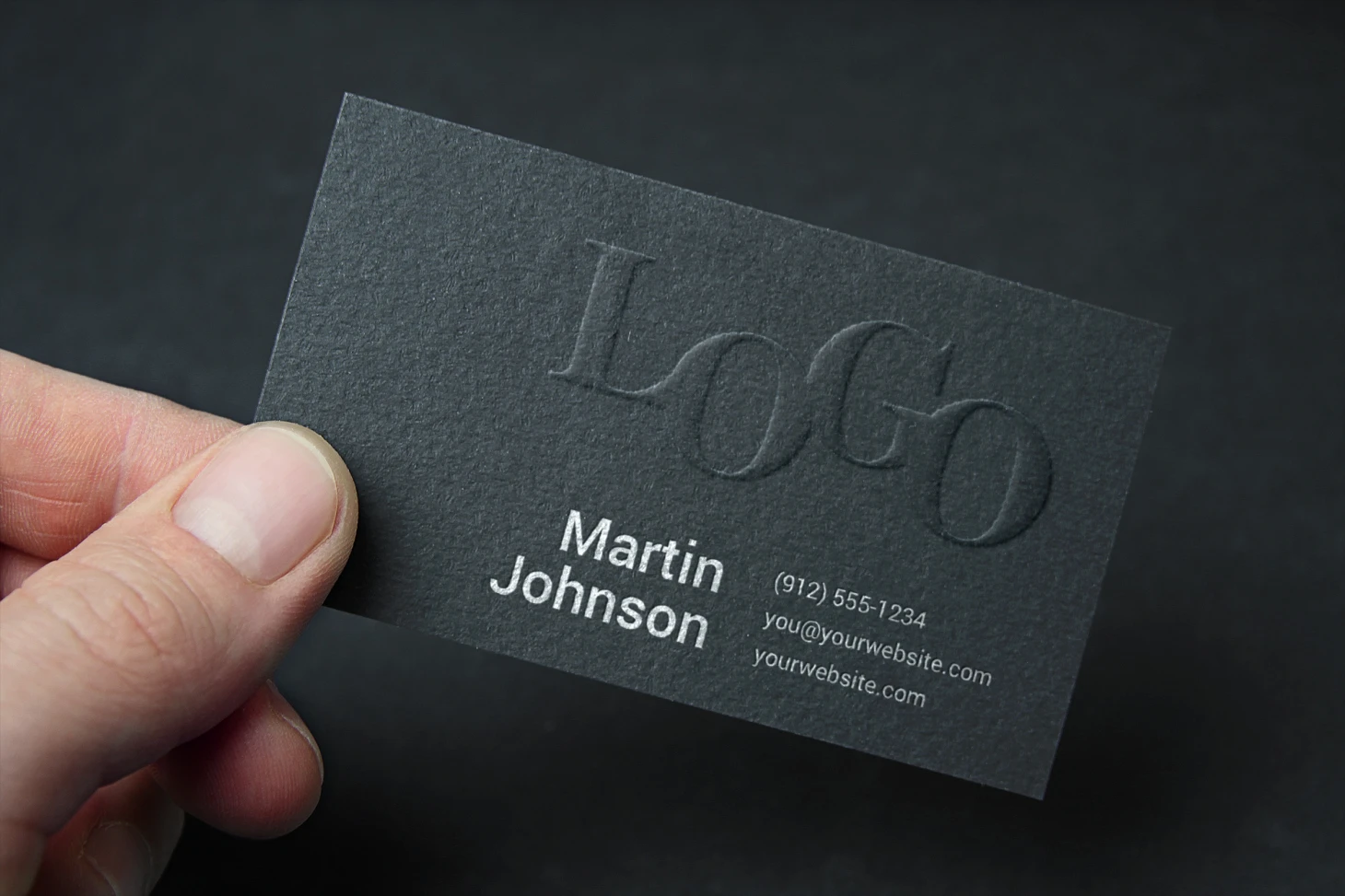
Variant: Tooltip font size and corner radius
The tooltip itself can be fine-tuned too. Here it has a larger font and fully rounded corners (16 px). By combining font size and corner radius you can match the tooltip to the overall style of your website.